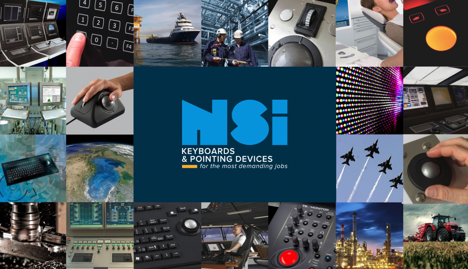
Rebranding of NSI's logo and corporate identity
07/06/2022
Rebranding of NSI's logo and corporate identity
NSI's original logo was created by a Brussels artist when the company was founded in 1988. Since then, we have proudly used this composition for more than 30 years. Our logo is now well known in the sector and still represents solidity and confidence.
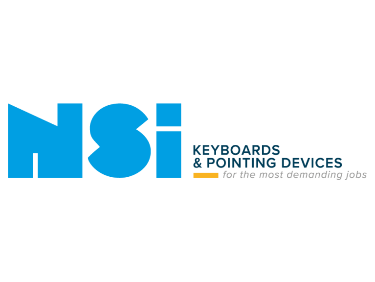
We love our logo, we love our brand, but we are also moving forward! So it was time to modernise our logo. This spring, our internal marketing manager renewed the existing NSI logo while maintaining and respecting the historic fundamentals of NSI.
The following changes were made:
- The composition of NSI is slightly repositioned so that the dimensions are completely correct.
- Our main product categories "keyboards & pointing devices" has been added to the logo.
- Our tagline "for the most demanding jobs" has been added to the logo. This confirms our values of providing high quality products in various sectors with high requirements.
- The logo was modernised by using a sleek font.
- The colours were adjusted and fixed. The orange accent colour gives an extra fresh and modern look to NSI.
With the renewal of the logo, we give our appearance a new boost, without detracting from our history.
If you would like to use our new logo and colours, you can download them from our download center.
